Thursday, April 5, 2012

My theme is showing the dark side of war through monuments. Is making monuments to "honor" fallen soldiers actually meant to glorify death and war? The pictures I took takes a different view on the American viewpoint of war.

I chose this theme because when I went to these memorials, I felt like we were not honoring our fallen soldiers, but glorifying death and war. To me, monuments to war aren't always held in a good light, sometimes they're held in a darker light. Monuments are usually made to honor people or events, so I thought it would be awesome if I contrasted what monuments stereotypically stand for and what they could stand for.

In order to achieve the feel I wanted, I used lighting and mood to show the darker side to war. I also used the rule of thirds to emphisize certain points, as well as using space/figures.


Tuesday, April 3, 2012


 I kind of want to make this a collage (the above image) and have words on the other side.


 I'm going to replace the actual person with another actual person but in a better postition.

This is my game plan with a few tweeks that I still need to do. I need to take pics of actual people dressed in uniform (not really in the army).
I'm actually kind of nervous about my pictures. I'm not sure if they're ok but oh well! I need to edit a few more pics and post them so hang with me!

Friday, March 23, 2012

 oops. Double post...
I really like the idea of a real soldier and then the korean memorial soldiers made of stone. It's like the real thing and then the memorial for them.

Monday, March 19, 2012

This is my diptych thingy. I like the contrast and also how it looks like there's a monument thingy in each pic. It creates unity.

Thursday, March 15, 2012

Spring Break is when I'm planning on doing some photoshoots with flags, blood, and some models. Right now I'm really busy but this will happen!!

Friday, March 9, 2012

 I'm trying to decide which grave phot I like better. I just have to figure out how to edit the names out of this one above.
 I like this one a lot. It has that Kennedy memorial in the back ( I think it's the kennedy..)
This one has a miniture washington monument in teh back and I really like the bushes in this one.

Week 4 right?

This is just an update. I'm just waiting for critique and I've also been thinking about addings some pictures with models in them. I have my dad's old guns so I just need a model...

Thursday, March 1, 2012

My Ten Photos!!
 This is picture of the Washington Monument. The day was really stormy, hence the clouds, but it was also sunny. Weird East Coast weather.
 This is, again, the Washington Monument but it has a different feel to it.
 This one had MAJOR editing done to it. I think it's cool but, someone else might not. This was at the WWII memorial.
 This was the changing of the guard at the Arlington memorial site. It's all black and white except for the soldier's face.
 This was just beautiful. The day was really stormy and I was cold so this is one of the 2 only unblurry photos.
 This was at the WWII memorial. I made the background really fuzzy but the words clear so you can read them.
 This was at the WWII memorial. I thought that it was a good story. I wanted the battle scene to be warm so that it can contrast the photo below with the peace scene being colder.
 This one is the same as above. It looks like a really good story too.
 This was at the WWII memorial.
This was at the Korean War memorial. I really liked the stone soldiers!

Tuesday, February 28, 2012

Well, today is the day I'm back from D.C. It was pretty good! But back to the subject on hand...I've decided to change my theme because of this trip. It's going to be patriotism?. Yes, that is a question mark, not a grammer mistake. It's saying "patriotism, yes or no?". I took 247 pictures while I was gone so hopefully I'm cool...The pictures are still uploading onto the computer so I'll post some as soon as they're done. By post I mean I'll put up the ones that I will put in my final 10 pictures. They are subject to change but as it's tuesday, I won't have much wiggle room. Anyway, just check them out! I'll put up some others from my trip that I won't have in my final but are just for fun so you can see what I did and where I went. Enjoy!

Friday, February 17, 2012

stillweek2

 This one is just playing around with editing. I'm probably not going to use this photo but I thought it was cool!
 This one is, again, just playing around.
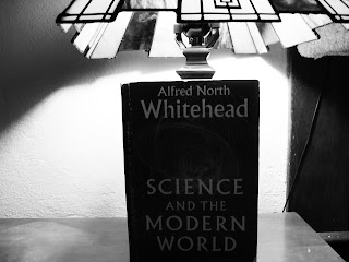
 I really like the boosted texture on the inside of the lamp. I also like how you can read the label.
I feel like this one has the darkness of modern day coming down to cover the olden day. It has a sense of impending doom!

Wednesday, February 15, 2012

week2

So this is the edited version. I just boosted up the contrast a bit. This picture would contrast with a computer or a cell phone or some other modern day electric entertainment console.

This is the un-edited version. As I said, I just boosted the contrast.

week2

Ok, I really want to try what this artist does. I feel like it will expand my horizons because I've never done something like this before. I really like this style though!  http://www.graceweston.com/

Thursday, February 9, 2012

Week 1

 I really like this one because of the face in the background. It could be lonliness without cell phones...
 I just thought that this was ironic that's all. I could use this one but I probably won't.
 This picture came from the "lamp vs candle". I really like the color scheme for this.
 I like this angle, but I don't like how bland the colors are.
I like the design on the inside but I wish that the light bulb stuff wasn't there. Though I suppose that's would be the whole point to the picture.