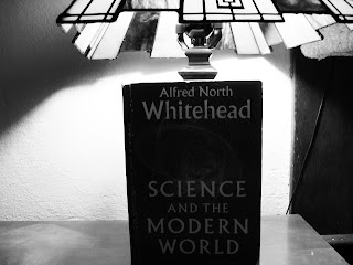
I really like this one because of the face in the background. It could be lonliness without cell phones...
I just thought that this was ironic that's all. I could use this one but I probably won't.
This picture came from the "lamp vs candle". I really like the color scheme for this.
I like this angle, but I don't like how bland the colors are.
I like the design on the inside but I wish that the light bulb stuff wasn't there. Though I suppose that's would be the whole point to the picture.


I think your idea has potential to result in intriguing imagery. I think the lamp image is strong in terms of movement, contrast and visual impact, and your first image has a nice story between the foreground and background. I would add the principles of design you plan to work with to your concentration statement.
ReplyDelete