I'VE CHANGED MY CONCENTRATION. Because I have a bunch of pictures of monuments and such, I've decided to show the dark side of war through monuments. Monuments are usually seen in a good light so I thought that it would be a good contrast as well as have good irony to use monuments in a negative way. I'll use rule of thirds, light+mood, Space+figure+ground, and color+mood.
Tuesday, February 28, 2012
Well, today is the day I'm back from D.C. It was pretty good! But back to the subject on hand...I've decided to change my theme because of this trip. It's going to be patriotism?. Yes, that is a question mark, not a grammer mistake. It's saying "patriotism, yes or no?". I took 247 pictures while I was gone so hopefully I'm cool...The pictures are still uploading onto the computer so I'll post some as soon as they're done. By post I mean I'll put up the ones that I will put in my final 10 pictures. They are subject to change but as it's tuesday, I won't have much wiggle room. Anyway, just check them out! I'll put up some others from my trip that I won't have in my final but are just for fun so you can see what I did and where I went. Enjoy!
Friday, February 17, 2012
stillweek2
This one is just playing around with editing. I'm probably not going to use this photo but I thought it was cool!
This one is, again, just playing around.
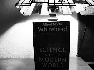
I really like the boosted texture on the inside of the lamp. I also like how you can read the label.
I feel like this one has the darkness of modern day coming down to cover the olden day. It has a sense of impending doom!
This one is, again, just playing around.
I really like the boosted texture on the inside of the lamp. I also like how you can read the label.
I feel like this one has the darkness of modern day coming down to cover the olden day. It has a sense of impending doom!
Wednesday, February 15, 2012
week2
So this is the edited version. I just boosted up the contrast a bit. This picture would contrast with a computer or a cell phone or some other modern day electric entertainment console.
This is the un-edited version. As I said, I just boosted the contrast.
This is the un-edited version. As I said, I just boosted the contrast.
week2
Ok, I really want to try what this artist does. I feel like it will expand my horizons because I've never done something like this before. I really like this style though! http://www.graceweston.com/
Thursday, February 9, 2012
Week 1
I really like this one because of the face in the background. It could be lonliness without cell phones...
I just thought that this was ironic that's all. I could use this one but I probably won't.
This picture came from the "lamp vs candle". I really like the color scheme for this.
I like this angle, but I don't like how bland the colors are.
I like the design on the inside but I wish that the light bulb stuff wasn't there. Though I suppose that's would be the whole point to the picture.
Subscribe to:
Comments (Atom)
.jpg)


